

The Psychology of Color in Marketing Campaigns: How Brands Use Color to Influence Your Decisions
Have you ever wondered why McDonald’s uses red and yellow, or why Facebook chose blue for its brand identity? The answer lies in the fascinating world of color psychology – a powerful tool that marketers have been leveraging for decades to influence consumer behavior, evoke emotions, and drive purchasing decisions.
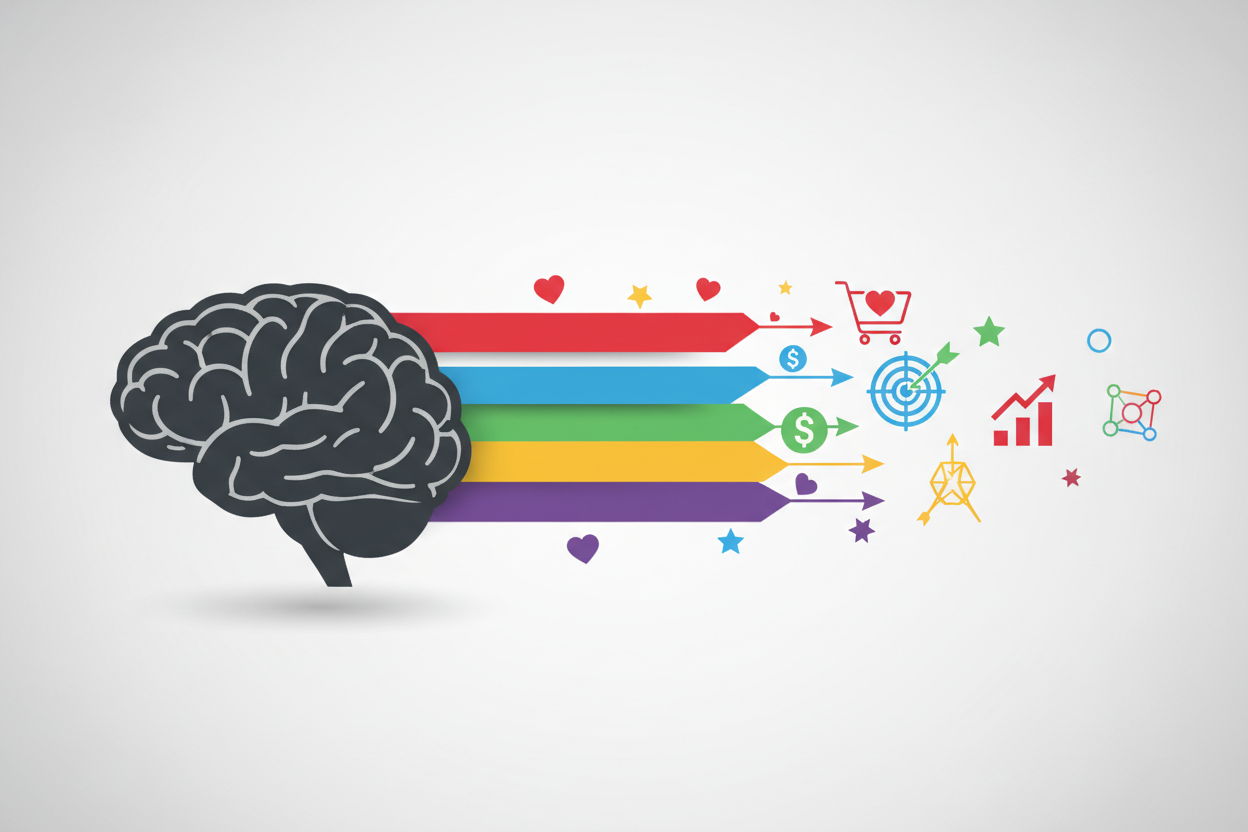
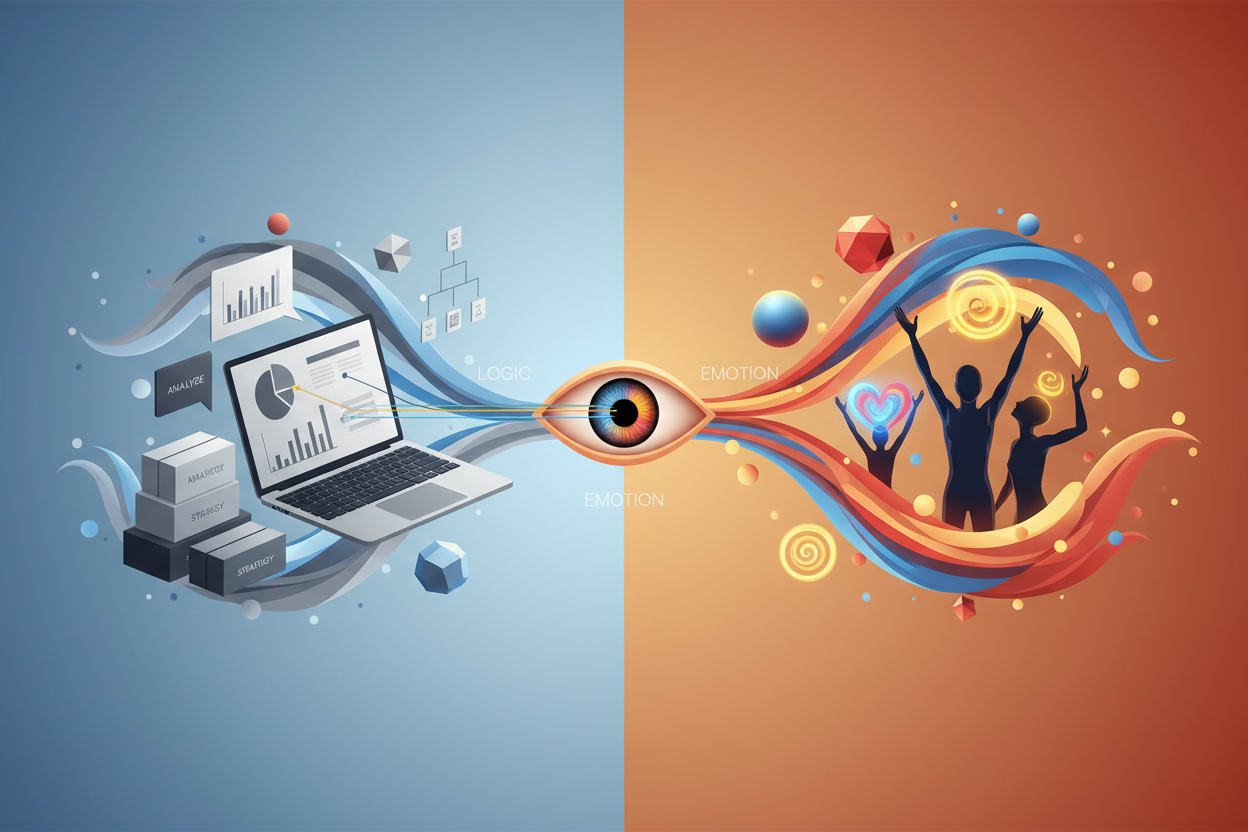
Color psychology in marketing isn’t just about making things look pretty. It’s a strategic approach that taps into the subconscious mind, triggering specific emotional responses and associations that can make or break a brand’s success. From the moment we see a product or advertisement, colors begin working their magic on our brains, often without us even realizing it.
In this comprehensive guide, we’ll explore how different colors affect consumer psychology, examine real-world examples of successful color marketing strategies, and provide practical insights you can apply to your own marketing campaigns. Whether you’re a business owner, marketer, or simply curious about the science behind brand colors, this deep dive into color psychology will change how you view marketing forever.
Understanding the Science Behind Color Psychology
Color psychology is rooted in both evolutionary biology and cultural conditioning. Our brains are hardwired to respond to certain colors based on millions of years of evolution. Red, for instance, signals danger or excitement because it’s associated with blood and fire. Blue reminds us of clear skies and calm waters, naturally evoking feelings of trust and tranquility.
Research has shown that people make subconscious judgments about products within 90 seconds of initial viewing, and between 62% and 90% of that assessment is based on color alone. This statistic alone should make any marketer sit up and take notice. The colors you choose for your brand, packaging, website, and advertisements aren’t just aesthetic decisions – they’re psychological triggers that can significantly impact your bottom line.
Neuroscientists have discovered that color processing happens in the limbic system, the same part of the brain responsible for emotions and memory. This explains why certain color combinations can instantly transport us back to childhood memories or make us feel hungry, excited, or calm. Smart marketers understand this connection and use it to create powerful emotional bonds between consumers and their brands.
The Emotional Impact of Primary Colors in Marketing
Red: The Color of Urgency and Passion
Red is perhaps the most powerful color in the marketing arsenal. It increases heart rate, creates a sense of urgency, and stimulates appetite – which explains why so many restaurants and food brands incorporate red into their branding. Think Coca-Cola, KFC, or McDonald’s. These brands didn’t choose red by accident; they selected it because red makes people feel energized and ready to take action.
In retail environments, red is often used for clearance sales and “limited time” offers because it creates psychological pressure to act quickly. However, red should be used strategically – too much can feel overwhelming or aggressive, potentially driving customers away rather than drawing them in.
Blue: Building Trust and Reliability
Blue is the world’s most popular color, and there’s good reason why tech giants like Facebook, Twitter, LinkedIn, and IBM have all chosen various shades of blue for their branding. Blue evokes feelings of trust, security, and professionalism. It’s calming without being passive, making it perfect for brands that want to appear reliable and trustworthy.
Financial institutions particularly love blue because it suggests stability and security – qualities people desperately want when choosing where to put their money. Studies have shown that blue can actually lower heart rate and blood pressure, creating a sense of calm that makes consumers more receptive to making rational purchasing decisions.
Yellow: Optimism and Attention-Grabbing Power
Yellow is the color of sunshine, happiness, and optimism. It’s also one of the most attention-grabbing colors, which is why it’s frequently used in warning signs and caution tape. In marketing, yellow can create feelings of warmth and friendliness, making brands appear more approachable and cheerful.
Brands like Best Buy, IKEA, and McDonald’s (in combination with red) use yellow to create a sense of fun and affordability. However, yellow can be tricky – too much can cause anxiety or appear cheap, while the right amount can make a brand feel welcoming and energetic.
Secondary Colors and Their Marketing Applications
Green: Nature, Growth, and Prosperity
Green carries powerful associations with nature, health, growth, and money. It’s no coincidence that Whole Foods, Starbucks, and countless organic food brands use green in their branding. Green suggests freshness, sustainability, and natural goodness – all highly valued qualities in today’s environmentally conscious market.
Financial services also leverage green’s association with money and prosperity. The color can make people feel more relaxed about spending money, which is why many banks and investment firms incorporate green into their visual identity. Additionally, green is easy on the eyes, making it an excellent choice for websites and apps where users spend extended periods.
Purple: Luxury and Creativity
Purple has historically been associated with royalty, luxury, and exclusivity. This is because purple dye was once extremely expensive to produce, making it accessible only to the wealthy elite. Today, brands use purple to convey premium quality, sophistication, and creativity.
Companies like Cadbury, Crown Royal, and Hallmark use purple to position themselves as premium or creative brands. Purple can also stimulate imagination and creativity, making it popular among brands in the beauty, fashion, and entertainment industries.
Orange: Energy and Enthusiasm
Orange combines the energy of red with the happiness of yellow, creating a color that’s both energetic and approachable. It’s associated with enthusiasm, creativity, and adventure. Brands like Harley-Davidson, Home Depot, and Fanta use orange to convey excitement and boldness.
Orange is particularly effective for call-to-action buttons and promotional materials because it creates a sense of urgency without being as aggressive as red. It’s also associated with affordability and value, making it popular among budget-friendly brands and discount retailers.
Cultural Considerations in Color Marketing
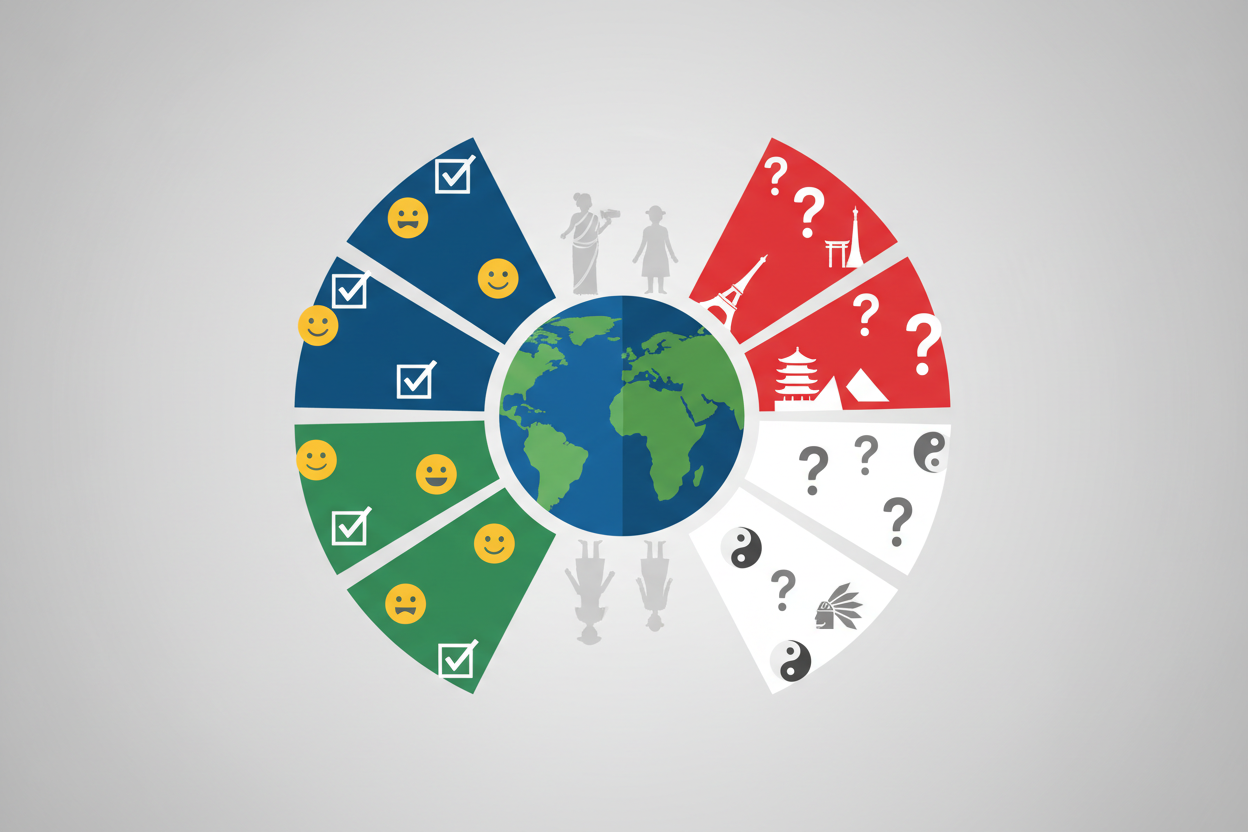
One crucial aspect that many marketers overlook is the cultural significance of colors. What works in Western markets might have completely different connotations in Asian, African, or Middle Eastern cultures. For instance, while white represents purity and cleanliness in Western cultures, it’s associated with death and mourning in many Asian countries.
Red is considered lucky and prosperous in China, which is why many brands adjust their color schemes when entering Chinese markets. McDonald’s, for example, uses red much more prominently in their Chinese restaurants than in Western locations. Similarly, green might represent nature and health in some cultures but could be associated with inexperience or jealousy in others.
Global brands must carefully research color meanings in each target market to avoid cultural missteps that could damage their reputation or offend potential customers. This cultural sensitivity in color choice can be the difference between successful international expansion and costly marketing failures.
Practical Applications: Color Strategies That Convert
Website Design and User Experience
Your website’s color scheme directly impacts user behavior and conversion rates. Studies have shown that changing the color of a call-to-action button can increase click-through rates by up to 21%. The key is creating contrast that draws attention while maintaining brand consistency.
Consider the psychological journey you want users to take on your website. Do you want them to feel calm and browse leisurely, or do you want to create urgency for immediate action? Blue backgrounds with orange buttons can create trust while encouraging clicks, while red elements can drive immediate purchases but might not be suitable for considered purchases like insurance or investment products.
Product Packaging and Retail Environments
Color psychology extends beyond digital marketing into physical retail spaces and product packaging. The colors you choose for packaging can influence perceived product quality, taste, and value. Luxury products often use black, gold, or deep purples to convey premium quality, while health products frequently incorporate green and white to suggest natural purity.
In retail environments, warm colors like red and orange can create excitement and encourage impulse purchases, while cool colors like blue and green can make customers feel more comfortable spending time browsing. Many successful retailers use color zoning – bright, energetic colors in promotional areas and calmer colors in sections where customers need to make considered decisions.
Measuring the Success of Color Psychology in Marketing
The beauty of color psychology in marketing is that its effectiveness can be measured through various metrics. A/B testing different color schemes on websites, advertisements, and packaging can provide concrete data about which colors drive better results for your specific audience and industry.
Key performance indicators to monitor include conversion rates, click-through rates, time spent on page, brand recall, and purchase intent. Many companies have seen dramatic improvements in these metrics simply by optimizing their color choices based on psychological principles and testing results.
Tools like heat mapping software can show you exactly how users interact with different colored elements on your website, while eye-tracking studies can reveal which colors capture and hold attention most effectively. This data-driven approach to color psychology ensures that your marketing decisions are based on evidence rather than assumptions.
Common Mistakes to Avoid in Color Marketing
While color psychology is powerful, it’s not foolproof. One of the biggest mistakes marketers make is assuming that color psychology works the same way for everyone. Personal preferences, past experiences, and individual associations can override general color psychology principles.
Another common error is using too many colors or choosing colors that clash with your brand identity. Consistency is crucial – if your brand is known for calm, trustworthy blue, suddenly switching to aggressive red in your marketing materials can confuse customers and dilute your brand identity.
It’s also important to consider accessibility when choosing colors. Approximately 8% of men and 0.5% of women have some form of color blindness, so relying solely on color to convey important information can exclude a significant portion of your audience.
Conclusion: Harnessing the Power of Color in Your Marketing Strategy
The psychology of color in marketing campaigns is far more than an aesthetic consideration – it’s a powerful tool that can significantly impact consumer behavior, brand perception, and ultimately, your business success. By understanding how different colors affect emotions and decision-making processes, you can create more effective marketing campaigns that resonate with your target audience on a subconscious level.
Remember that successful color marketing isn’t about following rigid rules, but rather about understanding your audience, testing different approaches, and measuring results. The most effective color strategies are those that align with your brand identity, resonate with your target market’s cultural background, and support your overall marketing objectives.
As you develop your marketing campaigns, consider the psychological impact of every color choice. Whether you’re designing a website, creating packaging, or developing an advertisement, the colors you select are silently communicating with your audience, influencing their emotions, and guiding their decisions. By harnessing this power thoughtfully and strategically, you can create marketing campaigns that not only look great but also drive real business results.
Frequently Asked Questions
Q: Does color psychology work the same way across all industries?
A: No, color psychology can vary significantly across industries. While general principles apply, industry context matters greatly. For example, red might work well for food brands to stimulate appetite, but it could be problematic for healthcare brands where calm and trust are more important than excitement.
Q: How do I choose the right colors for my brand if my target audience is global?
A: Research color meanings in your primary target markets and look for colors that have positive or neutral associations across cultures. Blue and green tend to have fairly consistent positive associations globally, while colors like red and white can vary dramatically in meaning between cultures.
Q: Can I use multiple colors in my marketing, or should I stick to one primary color?
A: You can definitely use multiple colors, but it’s important to establish a primary brand color and use additional colors strategically. Most successful brands use 2-3 primary colors with accent colors for specific purposes like call-to-action buttons or promotional materials.
Q: How quickly can changing colors impact my marketing results?
A: Color changes can have immediate impact, especially in digital marketing. Some companies see results within hours of changing button colors or website elements. However, for brand-level color changes, it may take longer for customers to adjust and for the full impact to be measurable.
Q: Is there a “best” color for conversion rates?
A: There’s no universally best color for conversions because effectiveness depends on your specific audience, industry, and brand context. However, orange and red are often effective for call-to-action buttons because they create urgency, while the key is ensuring sufficient contrast with your background colors.
Q: Should I consider color trends when choosing my brand colors?
A: While it’s good to be aware of color trends, your brand colors should be chosen based on your brand identity and target audience rather than current trends. Trends change quickly, but rebranding is expensive and can confuse customers. Choose timeless colors that align with your brand values for long-term success.