

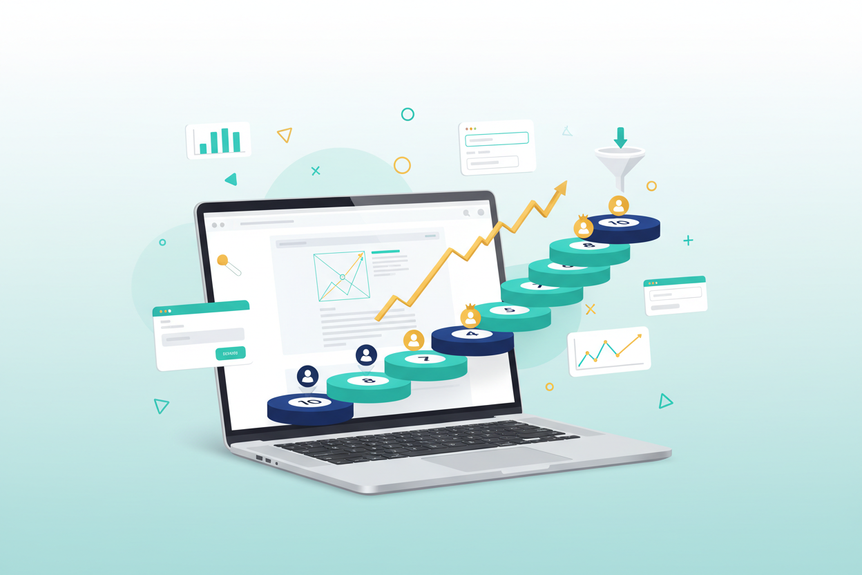
How to Design a 10-Step Landing Page That Converts Visitors into Customers
Picture this: you’ve just spent weeks crafting the perfect marketing campaign, driving traffic to your website, only to watch potential customers bounce away faster than a rubber ball. Sound familiar? You’re not alone. The average landing page conversion rate hovers around 2.35%, which means most businesses are leaving money on the table.
But here’s the thing – it doesn’t have to be this way. A well-designed landing page can be your secret weapon for turning curious visitors into paying customers. I’ve seen businesses triple their conversion rates simply by implementing the right strategies. Today, I’m going to walk you through a proven 10-step process that transforms ordinary landing pages into conversion powerhouses.
Whether you’re launching a new product, building an email list, or driving sales, these steps will help you create landing pages that actually work. Let’s dive in and turn your landing page into a customer magnet.
Step 1: Craft a Compelling Headline That Stops Scrollers in Their Tracks
Your headline is the make-or-break moment of your landing page. It’s the first thing visitors see, and you have approximately 8 seconds to capture their attention before they decide to stay or leave. Think of your headline as the hook in a great story – it needs to be irresistible.
A high-converting headline should clearly communicate your value proposition while addressing your visitor’s primary pain point. Instead of generic phrases like “Best Software Solution,” try something more specific like “Cut Your Project Management Time in Half with Our Automated Workflow Tool.”
The most effective headlines often follow proven formulas. You might use the benefit-driven approach (“Get 50% More Leads in 30 Days”), the problem-solution format (“Tired of Manual Data Entry? Here’s Your Solution”), or the curiosity-gap method (“The Simple Trick That Doubled Our Client’s Revenue”).
Remember to keep your headline concise – ideally under 20 words. Test different variations to see what resonates best with your audience. Sometimes a small tweak in wording can dramatically impact your conversion rates.
Step 2: Design Above-the-Fold Content That Converts
The area above the fold – what visitors see without scrolling – is prime real estate on your landing page. This section needs to work harder than a coffee shop barista during morning rush hour. Every element here should contribute to your conversion goal.
Start with a clean, uncluttered design that guides the eye naturally toward your call-to-action. Your value proposition should be crystal clear within seconds of landing on the page. Include your main headline, a supporting subheadline that elaborates on the benefit, and a prominent call-to-action button.
Visual hierarchy matters tremendously here. Use contrasting colors, strategic white space, and appropriate font sizes to create a logical flow. Your most important elements should be the most visually prominent. If your call-to-action button blends into the background, you’re essentially hiding your conversion opportunity.
Consider adding a hero image or video that supports your message. Visual content can increase engagement significantly, but make sure it loads quickly and doesn’t distract from your primary goal.
Step 3: Create Irresistible Call-to-Action Buttons
Your call-to-action button is where the magic happens – it’s the gateway between interest and action. Yet many businesses treat their CTA buttons as an afterthought, using generic text like “Submit” or “Click Here.” That’s like having a Ferrari and driving it in first gear.
Effective CTA buttons use action-oriented, benefit-focused language. Instead of “Download,” try “Get My Free Guide.” Rather than “Sign Up,” consider “Start My Free Trial.” The key is making the action feel valuable and immediate.
Color psychology plays a crucial role in CTA effectiveness. While there’s no universally “best” color, your button should contrast sharply with your page background. Orange and red often perform well because they create urgency, while green can suggest safety and “go.”
Size and placement are equally important. Your CTA button should be large enough to notice immediately but not so large that it overwhelms other elements. Place it strategically where the eye naturally flows, and don’t be afraid to include multiple CTAs throughout longer pages.
Step 4: Build Trust with Social Proof and Testimonials
In today’s digital world, trust is currency. Visitors are naturally skeptical of bold claims and promises. That’s where social proof becomes your best friend – it’s like having satisfied customers personally vouch for your business to every new visitor.
Customer testimonials are powerful, but generic praise won’t cut it. Seek specific testimonials that mention measurable results. “This software saved me 10 hours per week” carries much more weight than “Great product!” Include the customer’s name, photo, and company when possible to add authenticity.
Numbers speak volumes too. Display metrics like “Join 50,000+ satisfied customers” or “Rated 4.9/5 stars by 2,000+ users.” If you’ve been featured in reputable publications, showcase those logos prominently. Awards, certifications, and industry recognition all contribute to your credibility.
Case studies can be particularly effective for B2B landing pages. They tell a complete story of how your solution solved a real problem, making it easier for prospects to envision similar success.
Step 5: Optimize Your Lead Capture Forms
Your lead capture form is often the final hurdle between a visitor and a conversion. It’s also where many businesses accidentally sabotage their own success by asking for too much information upfront. The key is finding the sweet spot between gathering useful data and maintaining conversion momentum.
As a general rule, shorter forms convert better. For most purposes, asking for just an email address and first name is sufficient for initial lead capture. You can always collect additional information later in your nurturing process. Each additional form field can decrease conversions by 10-15%.
Make your form fields clearly labeled and easy to complete. Use smart defaults where possible, and consider implementing auto-fill functionality. The easier you make the process, the more likely visitors are to complete it.
Position matters too. While above-the-fold placement often works well, don’t be afraid to experiment with form placement throughout your page. Sometimes visitors need to read more about your offer before they’re ready to provide their information.
Step 6: Perfect Your Page Loading Speed
In our instant-gratification world, page speed isn’t just important – it’s critical. Research shows that 40% of visitors will abandon a page that takes more than 3 seconds to load. Every additional second of loading time can reduce conversions by up to 7%.
Start by testing your current page speed using tools like Google PageSpeed Insights or GTmetrix. These tools will identify specific issues slowing down your page and provide actionable recommendations for improvement.
Common speed killers include oversized images, excessive plugins, and bloated code. Optimize images by compressing them without sacrificing quality. Choose a reliable hosting provider that can handle your traffic volume. Consider using a content delivery network (CDN) to serve your content from servers closer to your visitors.
Remember that mobile page speed is particularly crucial, as mobile users often have slower internet connections. Google’s mobile-first indexing also means that mobile page speed directly impacts your search rankings.
Step 7: Ensure Mobile Responsiveness and User Experience
Mobile traffic now accounts for over half of all web traffic, yet many landing pages still provide subpar mobile experiences. If your landing page doesn’t work seamlessly on smartphones and tablets, you’re essentially turning away potential customers at the door.
Mobile-responsive design goes beyond simply making your page viewable on smaller screens. Text should be easily readable without zooming, buttons should be large enough to tap with a thumb, and forms should be simple to complete on a touchscreen.
Consider the mobile user’s context too. Mobile visitors are often multitasking or on-the-go, so your mobile landing page should be even more focused and streamlined than your desktop version. Eliminate unnecessary elements and prioritize the most important information.
Test your landing page on various devices and screen sizes. What looks perfect on your laptop might be completely unusable on a smartphone. Pay special attention to loading times on mobile networks, which are often slower than broadband connections.
Step 8: Eliminate Distractions and Navigation Elements
A landing page isn’t a regular web page – it has one specific job to do. Every element should either support your conversion goal or be removed. Think of it like decluttering your home: if it doesn’t serve a purpose, it’s just taking up valuable space.
Traditional website navigation is often the biggest culprit here. While navigation menus are essential for regular web pages, they can be conversion killers on landing pages. Each additional link gives visitors another opportunity to leave without converting.
Remove or minimize header and footer navigation, sidebar widgets, and any other elements that might tempt visitors to click away. If you must include navigation for legal or branding reasons, make it less prominent than your main conversion elements.
Apply the same principle to your content. Every paragraph, image, and section should move visitors closer to your conversion goal. If it doesn’t, consider removing it or moving it to a less prominent position on the page.
Step 9: Implement A/B Testing for Continuous Improvement
Even the most experienced marketers can’t predict with certainty what will resonate with their audience. That’s why A/B testing isn’t optional – it’s essential for maximizing your landing page performance. Think of it as your conversion optimization laboratory.
Start by testing one element at a time. You might test different headlines, CTA button colors, form lengths, or image choices. Testing multiple elements simultaneously makes it difficult to determine which change actually impacted your results.
Focus on testing elements that are likely to have the biggest impact first. Headlines, CTA buttons, and value propositions typically offer the most significant opportunities for improvement. Once you’ve optimized these major elements, you can move on to smaller details.
Ensure your tests run long enough to achieve statistical significance. This usually means collecting at least 100 conversions per variation, though the exact number depends on your current conversion rate and traffic volume. Don’t make decisions based on incomplete data.
Step 10: Analyze Performance and Iterate
Creating a high-converting landing page isn’t a one-and-done task – it’s an ongoing process of measurement, analysis, and improvement. The most successful businesses treat their landing pages like living documents that evolve based on data and user feedback.
Set up comprehensive tracking using tools like Google Analytics, heat mapping software, and conversion tracking pixels. Monitor key metrics including conversion rate, bounce rate, time on page, and traffic sources. Each metric tells part of the story about your page’s performance.
Heat maps can be particularly revealing, showing you exactly where visitors click, how far they scroll, and where they spend the most time. This data often reveals unexpected insights about user behavior that can inform your optimization efforts.
Don’t forget to analyze your traffic sources too. Visitors from different channels (social media, email, paid ads) might behave differently and require different messaging or design approaches. Consider creating specialized landing pages for different traffic sources when warranted.
Conclusion: Your Path to Landing Page Success
Creating a high-converting landing page isn’t rocket science, but it does require attention to detail and a commitment to continuous improvement. By following these 10 steps, you’ll have a solid foundation for turning more visitors into customers.
Remember that the best landing page is the one that works for your specific audience and goals. What converts amazingly well for one business might fall flat for another. The key is to start with these proven principles and then test, measure, and refine based on your actual results.
Don’t try to implement everything at once. Pick the areas where you see the biggest opportunities for improvement and start there. Small, consistent improvements often yield better results than dramatic overhauls.
Most importantly, keep your visitor’s needs at the center of every decision. When you focus on providing genuine value and making their experience as smooth as possible, conversions will naturally follow. Your landing page should feel like a helpful guide, not a pushy salesperson.
Start implementing these strategies today, and watch your conversion rates climb. Your future customers – and your bottom line – will thank you for it.
Frequently Asked Questions
What’s the ideal length for a landing page?
There’s no one-size-fits-all answer to landing page length. Simple offers like newsletter signups often work best with shorter pages, while complex products or services may require longer pages to address all visitor concerns. The key is including enough information to drive conversions without overwhelming visitors. Test different lengths to see what works best for your audience.
How many call-to-action buttons should I include on my landing page?
For shorter landing pages, one prominent CTA is usually sufficient. Longer pages can benefit from multiple CTAs placed strategically throughout the content – typically after you’ve presented key benefits or addressed common objections. Just ensure all CTAs lead to the same conversion goal to avoid confusing visitors.
Should I include pricing information on my landing page?
This depends on your business model and sales process. For low-cost products or services, including pricing can increase trust and conversions. For high-ticket items or complex B2B solutions, you might want to focus on generating leads first and discuss pricing in follow-up conversations. Test both approaches to see what works better for your audience.
How long should I run A/B tests before making decisions?
A/B tests should run until you achieve statistical significance, which typically requires at least 100 conversions per variation. Depending on your traffic and conversion rate, this might take anywhere from a few days to several weeks. Avoid making decisions based on early results, as they can be misleading due to small sample sizes.
What’s the biggest mistake people make with landing pages?
The most common mistake is trying to accomplish too much with a single page. Effective landing pages have one clear goal and eliminate everything that doesn’t support that goal. Many businesses also fail to test and optimize their pages, missing opportunities to significantly improve their conversion rates through small adjustments.